


There is no denying that the broad markets remain in a resilient uptrend off the April 2025 low. But if there’s one thing I’ve learned from many years of analyzing charts, it’s to remain vigilant during bullish phases. Even though I’ll assume the uptrend is still intact, that doesn’t mean I can stop looking for signs of potential weakness!
With that in mind, here are three bearish candle patterns that often pop up during bullish market phases. By looking for these patterns in the stocks and ETFs that you own, you can hopefully get ahead of any corrective moves and take profits before it’s too late!
The Shooting Star Pattern
If you see a long upper shadow, little to no lower shadow, and the open and close are close together near the bottom of the day’s range, then you have identified a shooting star candle pattern. If you’re familiar with the hammer candle pattern, then you can think of this as a hammer candle but basically everything is upside down!

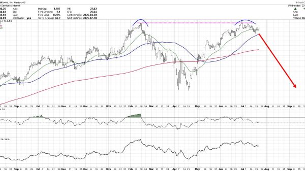
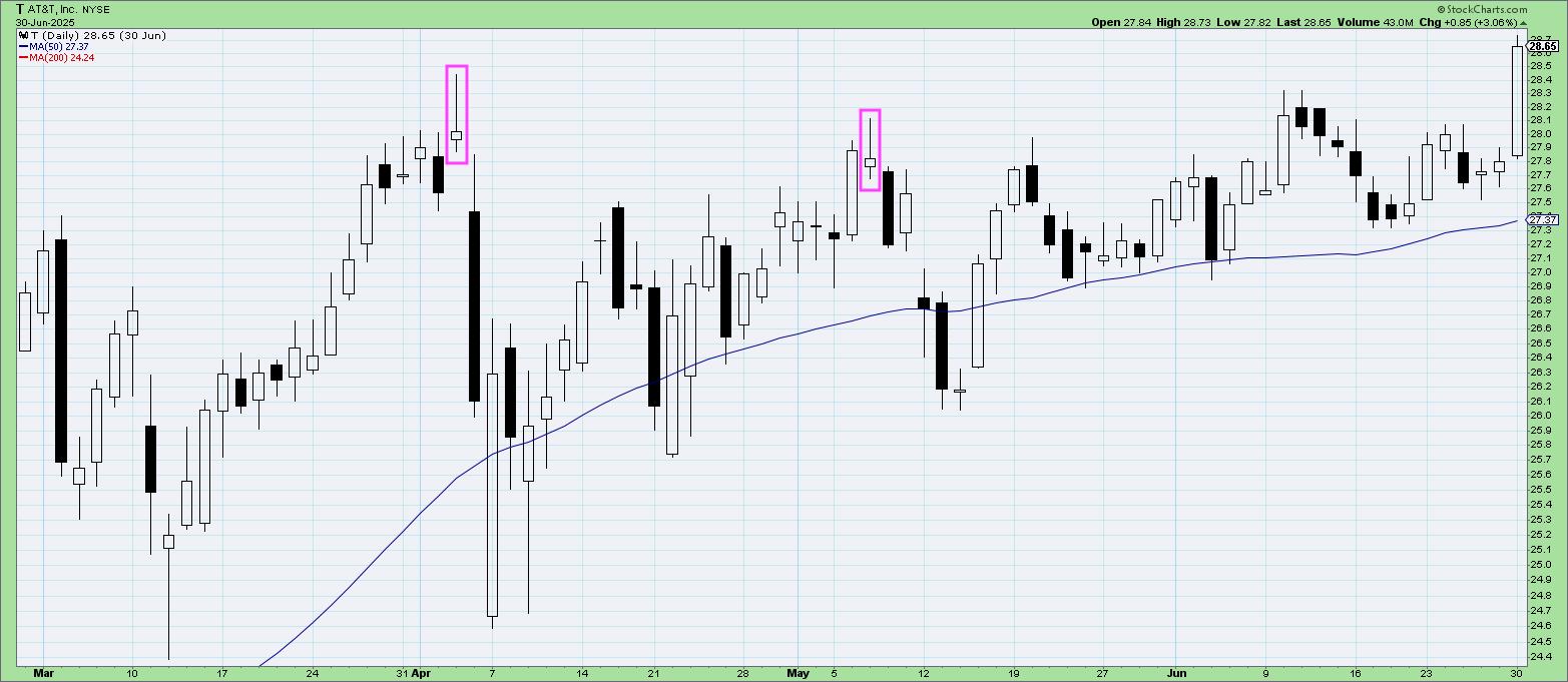
The chart of AT&T (T) has featured a number of shooting star candles so far in 2025. Just before the selloff in early April, there was a clear shooting star candle after the March rally. Then during the rally off the April low, a shooting star pattern in early May suggested that the uptrend phase was nearing an exhaustion point.
The Bearish Engulfing Pattern
One of the most recognizable patterns in the candlestick library, the bearish engulfing pattern represents a short-term rotation from accumulation to distribution. Basically, a large up candle is followed by a large down candle, and the second day’s “real body” (the open-to-close range) engulfs the range of the first day’s real body.
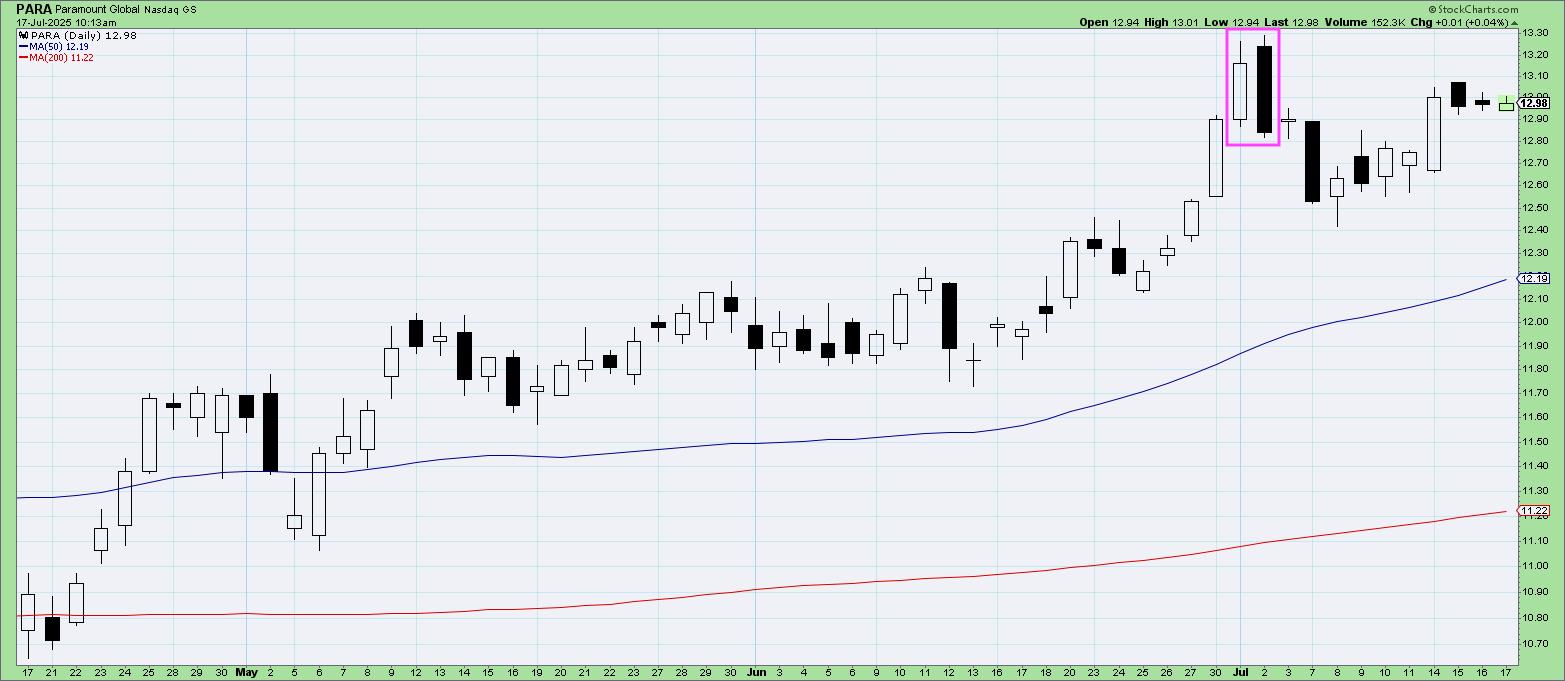
Look at the strength in the uptrend for Paramount Global (PARA) going into early June. Then just before the 4th of July weekend, a bearish engulfing pattern suggests a change of character as the bears take control. It’s worth noting that these candle patterns are not long-term signals, but rather indicate short-term dynamics. So a bearish engulfing pattern suggests weakness for the next one to three bars.
The Evening Star Pattern
If you took the bearish engulfing pattern, and then added another small candle in the middle of those two days, then you’d have an evening star pattern. Now most candlestick textbooks will tell you that the “star” day in the middle should include a gap, so there’s no overlap between that day’s range and the other two candles. In practice, I’ve found most people ignore this detail and rather look for patterns with enough similarities to this basic structure.
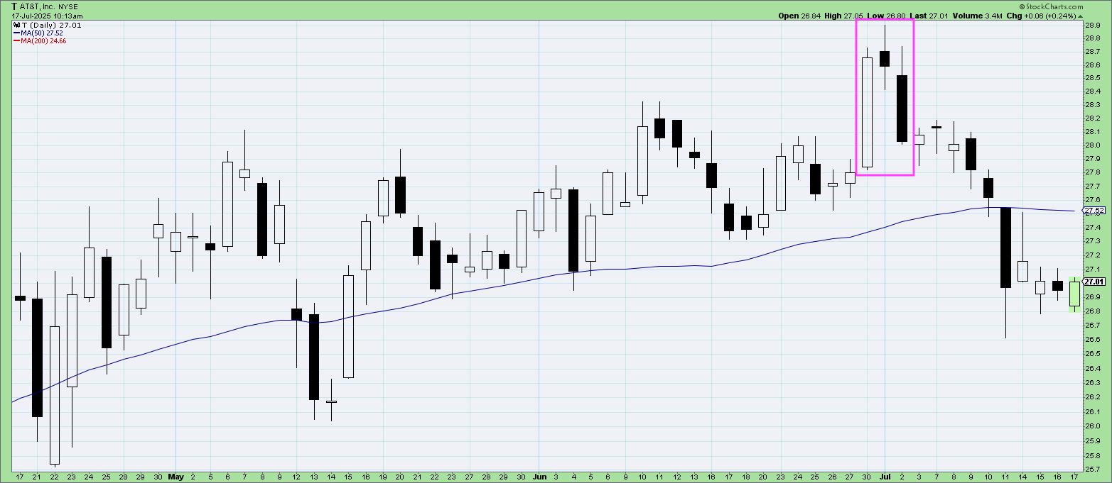
Going back to the AT&T chart we used earlier, we can see an evening star pattern at the end of June. A big day is followed soon after by a big down day, with a small candle in the middle. This is a great example of where additional weakness led the price below the 50-day moving average, serving to confirm the bearish outlook as represented by the evening star pattern.
It’s so easy to become complacent during an extended bull market rally. Investors that regularly scan for bearish candle patterns have an edge, as they can anticipate potential turning points before the uptrend changes in dramatic fashion to a new downtrend phase!
RR#6,
Dave
PS- Ready to upgrade your investment process? Check out my free behavioral investing course!
David Keller, CMT
President and Chief Strategist
Sierra Alpha Research LLC
https://www.youtube.com/c/MarketMisbehavior
Disclaimer: This blog is for educational purposes only and should not be construed as financial advice. The ideas and strategies should never be used without first assessing your own personal and financial situation, or without consulting a financial professional.
The author does not have a position in mentioned securities at the time of publication. Any opinions expressed herein are solely those of the author and do not in any way represent the views or opinions of any other person or entity.